
But this week, Keith had a great idea. Instead of going for the straight forward image of "lines," he thought of lines in a play. I spent a futile half-hour trying to track down the script from when I was the lead in a play in high school (Did you know I was a drama nerd in high school? I totally was. President of the Drama Club and in all the plays.) I thought that would be cool because not only would you see lines, but you'd also have highlighting and blocking notes, etc.
When that search failed—I know it's around here somewhere, though!—Keith went back to my trusty Norton Shakespeare from college. He chose the famous "to be or not to be" speech from Hamlet and started snapping.
The problem with the Norton, however, is that it's massive. The pages are all tissue-paper thin, and the words are miniscule. So the words from the other side of the page were bleeding into the current page, and it was hard to even get enough words in focus to really convey his idea.
He took a few pictures of the play and, dissatisfied, went back to a more obvious interpretation of lines, laying out match sticks on the dining room table. He showed me a few of those pictures and asked me which I liked best. I immediately asked why he'd abandoned the play idea, and he told me about the difficulties he was having with it. I scrolled further back on the camera (just a reminder that there's no way challenges like this would have been at all feasible before the wonder of digital cameras) to see the play pictures. I could understand what he was saying about the difficulties of composition, but I still liked the idea so much, I thought it might be worth sacrificing a bit in the clarity of the image to preserve the overall theme.
As I argued my case for Shakespeare, Keith looked a little more closely at one image in particular. He decided that maybe he could crop it and, by getting rid of much of the out-of-focus text, make the in-focus text larger and more legible. He also did something to make the image more monochromatic. "It's so dramatic!" I couldn't resist saying when he showed me the final version:
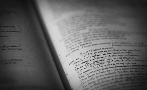
I'm glad he stuck with his original idea, because I thought it was very unique and more interesting than simply a visual take on "lines." Just reading part of this play, however, makes me realize how long it's been since I've seen live Shakespeare, and how much I miss it. Alas, I don't think there's going to be much of that in our near future. Maybe I'll have to settle for a Kenneth Branagh movie. But then I could read the lines as I watch, which is also good. I'll keep my Norton handy!
No comments:
Post a Comment